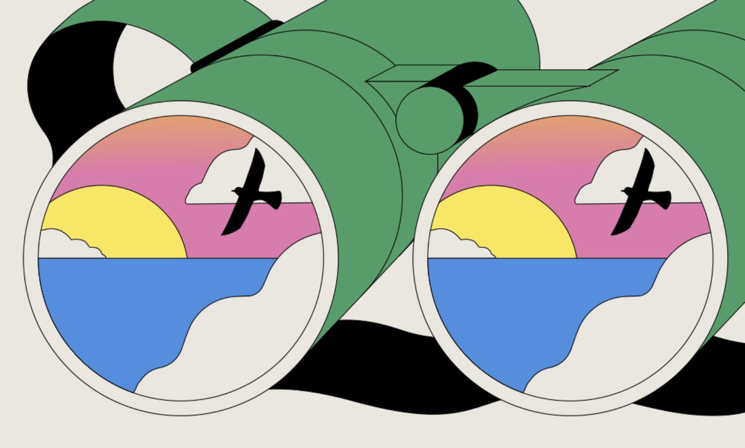
BUCK x LinkedIn: Elevating Career Milestones with Globally Resonant Celebration Illustrations
When someone lands a new job or marks a work anniversary on LinkedIn, the moment deserves more than a generic graphic. For the platform’s billion-plus users, these career milestones hold real meaning—and the visuals that accompany them should reflect that significance.
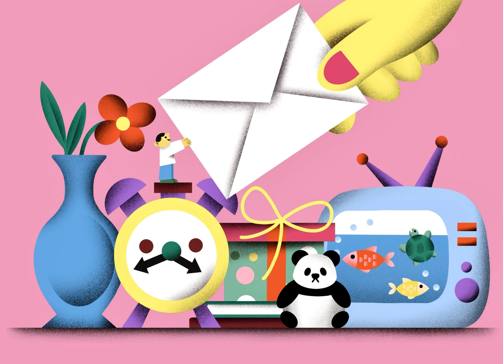
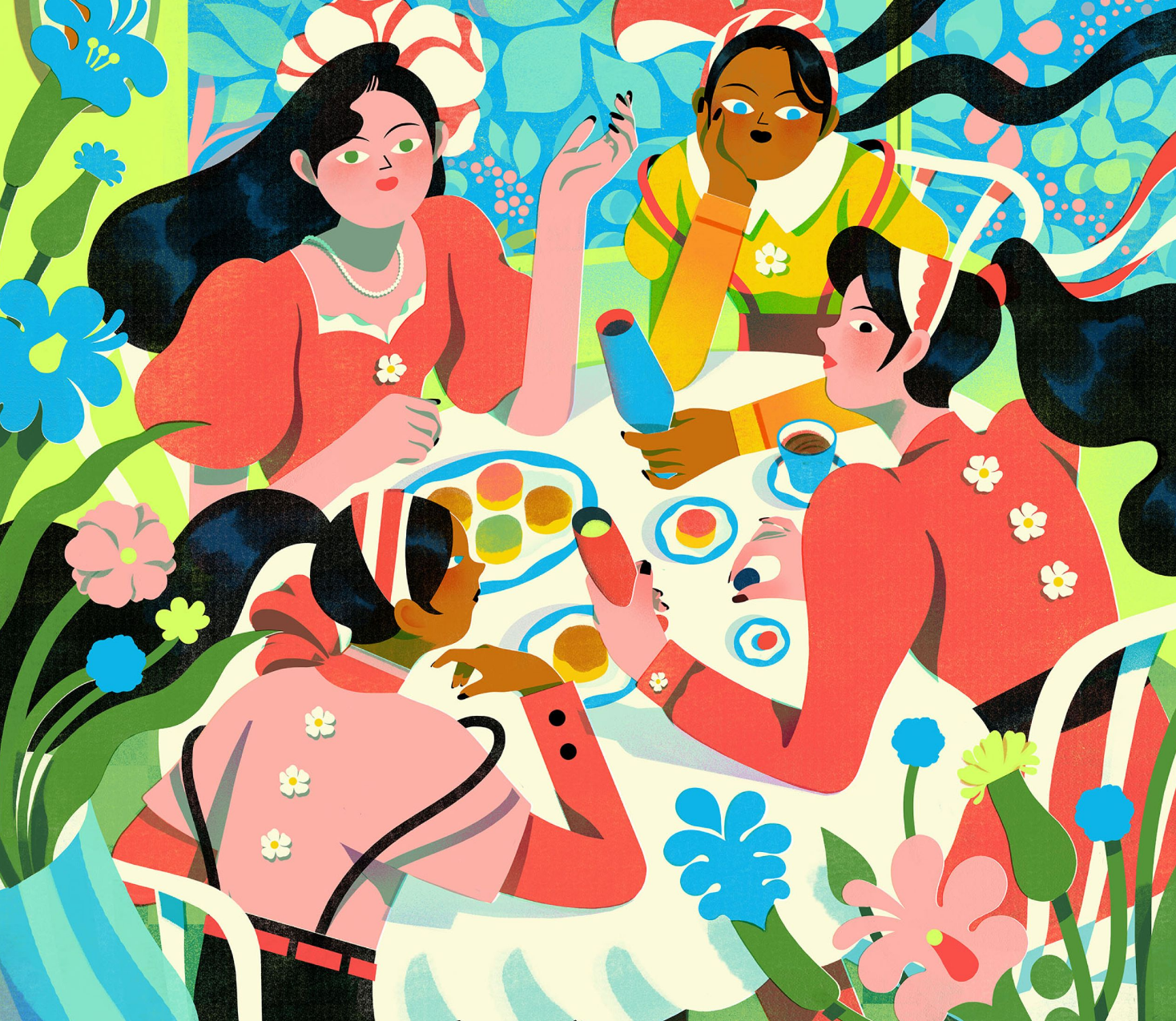
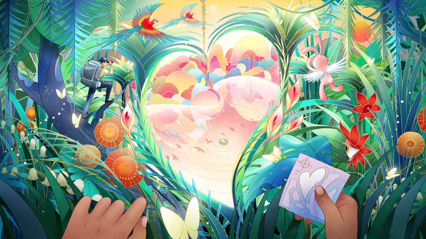
Design studio BUCK recently partnered with LinkedIn to refresh the platform’s celebration graphics: the in-feed illustrations that highlight moments like new roles, certifications, and work anniversaries. The end result? A set of 16 animated illustrations users can choose from, each crafted to resonate across cultures while giving people space to express their unique celebration style.
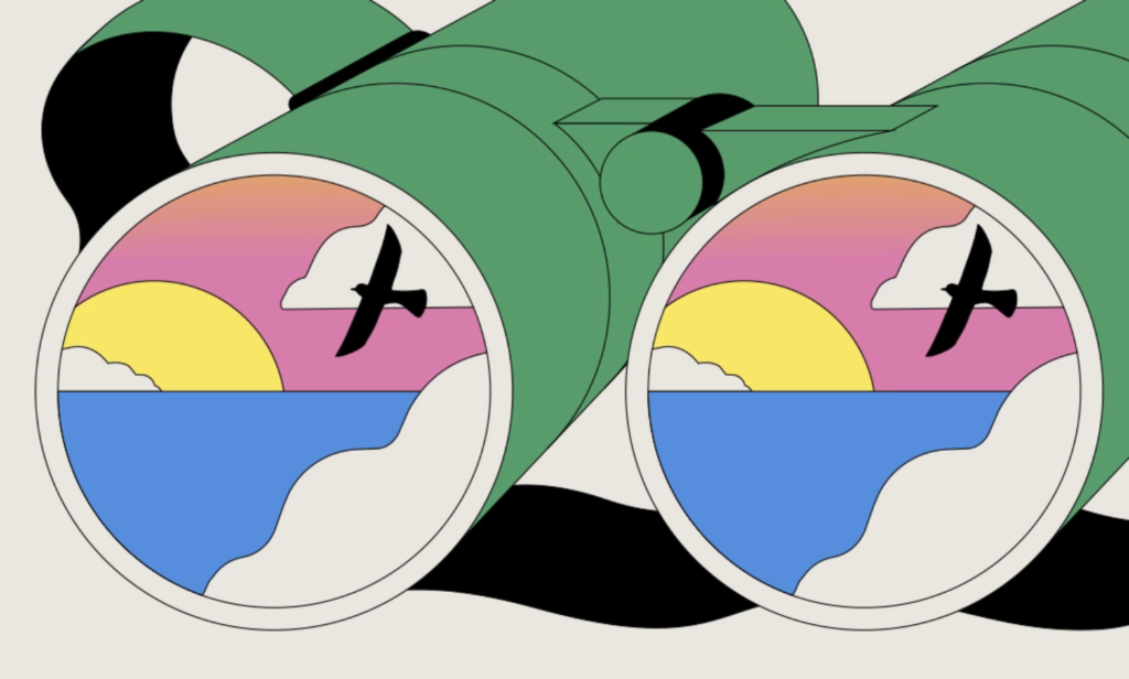
“These new visuals are like carefully selected artwork that brings the LinkedIn brand to life, making milestone moments feel more personal, vibrant, and true to you,” says Sarah Alpern, LinkedIn’s vice president of architecture and head of design.
For BUCK’s art director, Twisha Patni, and her team, the project meant solving a deceptively complex problem: how to create illustrations that feel meaningful to a global audience without relying on tired visual clichés?
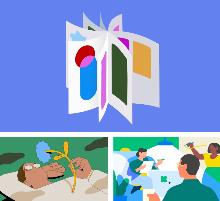
Building a System, Not Just a Collection
The brief was straightforward yet ambitious. “LinkedIn approached BUCK to reimagine their ‘celebration’ moments,” Twisha recalls. “The ask had two parts: develop a refreshed illustration and motion system that felt expressive, elevated, and globally resonant, while also aligning with LinkedIn’s evolving brand direction.”
The project moved quickly—10 weeks from strategy to delivery—with BUCK leading design and animation while collaborating closely with LinkedIn’s brand and product teams. “They were clear, thoughtful, and incredibly open to creative exploration,” Twisha says. “Their goal was to give LinkedIn members a wider range of ways to represent their important milestones on the platform.”
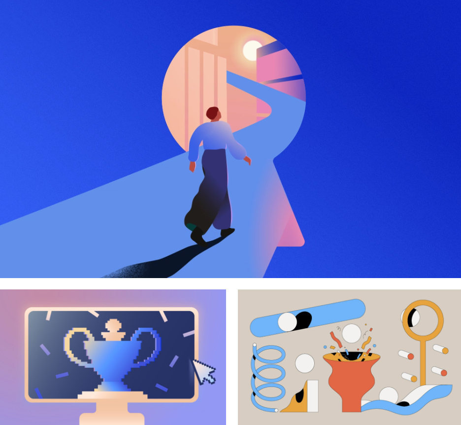
That focus on variety became central to the work. Instead of settling on a single visual style, BUCK’s strategy team first helped define LinkedIn’s brand role as what they call “an active guide”—a resource that helps members navigate change and discover new opportunities.
From there, they established design attributes and creative constants that would ensure cohesion across different illustration styles while keeping clear ties to LinkedIn’s core brand. “Based on guidance from LinkedIn and insights from our strategy work, we developed a family of cohesive illustration styles,” Twisha explains. “These styles spanned a broad tonal range to ensure universal accessibility and resonance. Our conversations dug into what ‘celebration’ means across cultures, roles, and milestones. We wanted to move beyond overused tropes to something more surprising and meaningful, so users would connect with the illustrations on an emotional level.”
User experience research reinforced this approach. As Twisha notes, the key insight was that “emotional resonance matters just as much as visual design—and color amplifies that impact.”
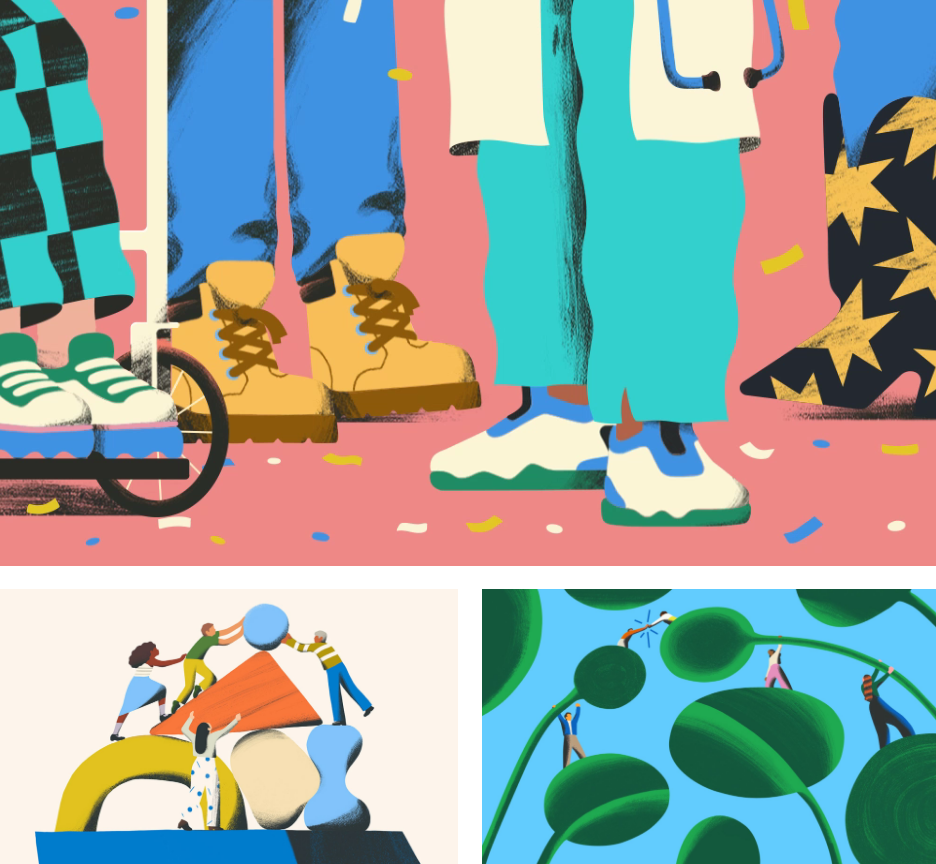
The Glow-Up
Audrey Davis, LinkedIn’s director of product design and creative systems, described the refresh as “a big glow-up”—a compliment that delighted the BUCK team. But what does that mean in concrete design terms?
“The ‘glow-up’ refers to expanding the visual language by adding more intentional storytelling,” Twisha explains. “The visual system needed to adapt to different types of milestones—from bold and momentous to small and quietly meaningful. We built layered compositions, added gestural moments, and created visual metaphors that feel wittier, clearer, more editorial, and approachable.”
The work built on LinkedIn’s existing celebration system, which was rooted in geometric shapes: circles, squares, and clean forms. BUCK blended these with organic elements, natural textures, and human gestures to add warmth without abandoning that structural foundation.
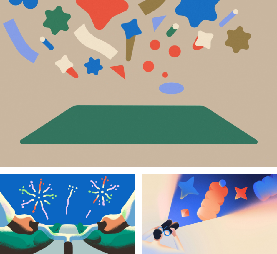
“This mix of geometric and organic allowed us to communicate structure and growth at the same time,” Twisha says. “It also mirrored the balance LinkedIn is trying to strike with its brand: professional but human, global but personal, sincere but expressive.”
Metaphors That Work Everywhere
Developing distinct visual metaphors that resonate across cultures required careful, methodical thinking. “We started by identifying universal themes like inspiration, collaboration, achievement, and innovation,” Twisha says. “Then we translated those into metaphors that feel fresh, accessible, and familiar at a glance. We steered clear of overused tropes, choosing visual ideas that are simple but open to interpretation.”
Throughout the process, every concept was vetted for cultural neutrality. “LinkedIn was crucial in this step, bringing in their own research and insights to make sure nothing felt alienating or too specific,” Twisha notes.
The studio developed four distinct illustration styles tied to their system principles—ranging from textured, hand-crafted moments to bold geometric compositions and subtle gradient effects. “This versatility let us speak to LinkedIn’s global, multicultural audience without leaning too heavily into any single metaphor or mood,” Twisha explains.
Strategic Thinking
Making the illustrations user-selectable wasn’t just about offering variety; it was a core design decision rooted in understanding how people experience milestones differently. “Celebration—whether professional or personal—has many different tonal ranges,” Twisha says. “What feels joyful or momentous to one user might feel quiet or reflective to another. By identifying themes that span this tonal spectrum—from calm to optimistic to energetic—we crafted a range of visuals that let users choose how they mark their milestone, adding a layer of emotional intelligence to the product.”
This approach also meant the illustrations needed to adapt across an emotional spectrum while staying cohesive. “Strategically, it’s a way for LinkedIn to show care for its users’ individuality without sacrificing brand consistency,” Twisha says.
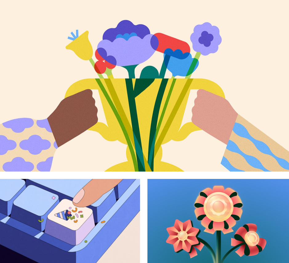
Brand Recognition
LinkedIn’s signature blue both limited and presented an opportunity. BUCK’s solution was elegant: treat it as “a thread rather than a boundary.”
“In every illustration, there’s a focal or supporting moment where that brand color quietly anchors the composition,” Twisha explains. “Around that, we introduced an expanded palette of neutrals and accent tones that support the emotional tone and metaphor. This gave us room to create vibrant or minimal compositions depending on the moment, without losing brand clarity. The result is a visual system that feels unmistakably LinkedIn but far more expressive and editorial.”
Motion added the final touch. “The animations use seamless loops, static cameras, and small storytelling gestures to feel reflective and purposeful without overwhelming the feed,” Twisha says. “Even the quietest animations have rhythm and personality: a flower spinning, people bending large plants in unison, confetti popping from a keyboard. These little gestures add dimension and help users feel like their milestone is not just noticed, but valued.”
The animation team also solved technical challenges, finding smart ways to refine and optimize lightweight JSON file sizes while making each frame feel dimensional and dynamic.
Representing People at Scale
With over a billion users, inclusive character representation required careful consideration. “In some illustrations, people are represented through universal gestures—like hands passing an object or feet in motion,” Twisha explains. “This allowed for relatability without specificity. Where full characters were depicted, we focused on variety in form, skin tone, and styling while avoiding overly literal or prescriptive identities.”
The goal, she says, was to create work that “felt open, thoughtful, and reflective of LinkedIn’s global audience.” Editorial cropping and intentional composition helped balance clarity with inclusivity, creating a feel that’s natural rather than formulaic.
Overall, this project shows how thoughtful illustration systems can bring humanity and cultural resonance to global platforms, turning generic digital moments into something genuinely personal.
For creative professionals working at scale, it’s a valuable reminder that constraint and flexibility aren’t opposites. Sometimes the most expressive systems are built on the clearest foundations.